As an Artist and Art Teacher
Share
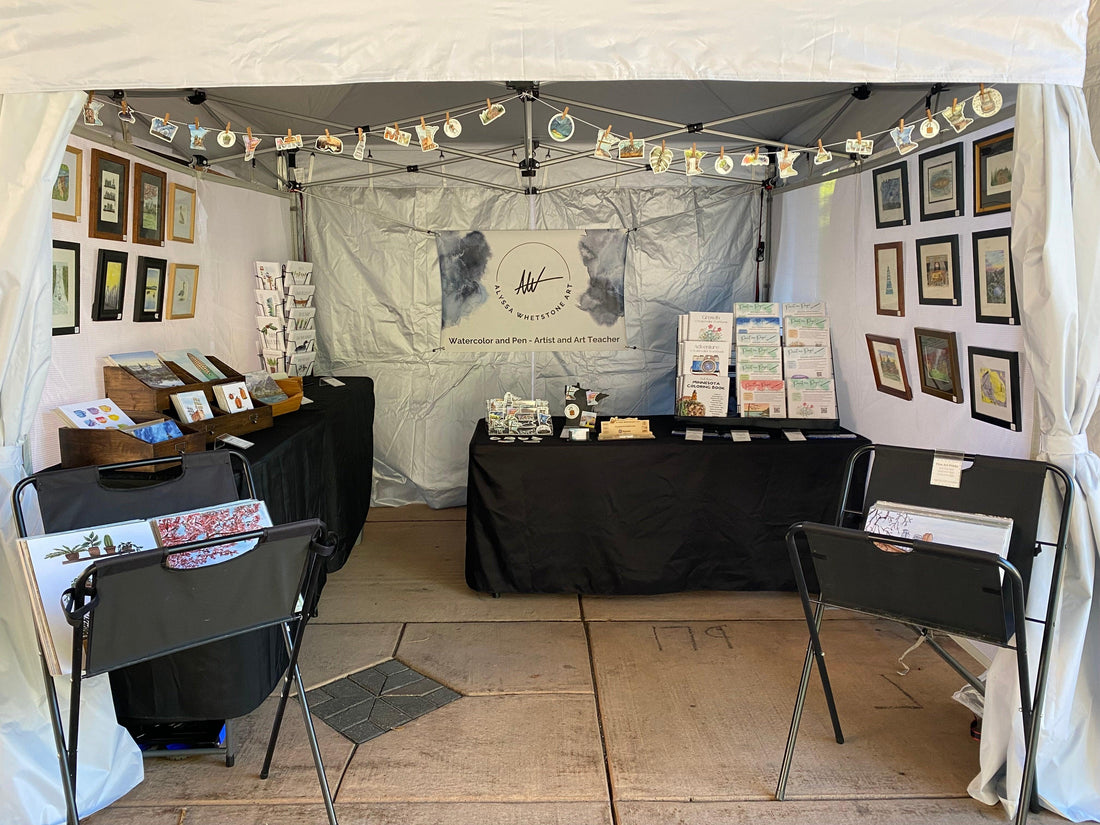
This previous weekend I participated in my second highest revenue art fair of the year.
I drove carefully along the narrow path between the scenic lake and artists setting up their tents for the weekend. Finally, I found my own number and set up my tent under an overpass along the art fair route.
Throughout the weekend we enjoyed the shade of the bridge, and exciting conversations with customers.
When I started selling at art fairs consistently three years ago, my own art was my only product.
These days, half my sales come from my products that help others learn to paint such as my workbooks and Paint Me! pages.
It's my favorite thing of all time when someone walks over, jaw hanging open, as they page through the workbook and realize what they've found.
"This is such a cool idea!" "Wow, I've never seen something like this!"
My favorite words.
It has been so fulfilling to invite others to experience the joy that watercolor brings.
On that note, let's move on to this week's tip, tutorial, and tool!
This Week's Tip:
I've noticed a theme during the private lessons I teach.
How do you choose what color to use? Which blue? Which yellow?
Often we get the exciting new paint set with 30 colors because they're all so pretty and shiny and it seems like more is better!
However, when there are too many colors to choose from we end up stuck, staring overwhelmed into the void of rainbow.
Instead, less is more. Get a set of the 8 main colors. Red, orange, yellow, green, blue, purple, brown, and black.
Using these colors, you can make any other color you need!
And because you have one blue, even when you mix that blue to make a teal, the teal and blue will still "get along" as I say because they're related.
So the next time you're drawn to that giant palette of colors, take a breath and remember that you can mix and personalize your art with just the basics.
If the color wheel is something you want a better grasp on, check out my Color Wheel Crash Course and use code STARTNOW for 10% off!

This Week's Tutorial:
Fall is approaching, at least it felt like it this last weekend with 50 degree mornings. Fall is one of my favorite seasons to paint.
I love the muted colors and warm tones.
But how do we mix colors to make those beautiful tones?
Find out in this week's YouTube short and give it a try!
It'll only take you a couple minutes to achieve that satisfying muted tone for your next painting.
Watch it on youtube here or instagram here.

This Week's Tool:
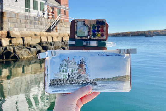
Because this week's tip is about paint palettes, I want to share some of my favorites!
My go-to paints are Winsor & Newton Cotman like this set here. You can see all my recommended supplies on my website here.
Hopefully you know by now that I'm a huge advocate for using what you have. If you have a set of elementary watercolors from five years ago, just use that!
Whatever gets us painting is the perfect paint.

I'm so glad you want to give watercolor painting the good old college try. It's so much fun!
Stay Creative,
-Alyssa


